YANA international

YANA international

YANA international

Clarifying Mission,Simplifying Giving

Clarifying Mission,Simplifying Giving

Clarifying Mission,Simplifying Giving

Collaborative website redesign to help visitors instantly understand the impact and donate without obstacles

Simple navigation

Clear messasing

Easy donation flow

Simple navigation

Clear messasing

Easy donation flow

Simple navigation

Clear messasing

Easy donation flow

Project Overview

Project Overview

A comprehensive website redesign focused on improving user experience, strengthening brand identity, and increasing donation conversions

Role: UX Designer [ Team of 4 ]
Timeline: 4 months [ Launching Jan 2026 ]

Problem
Problem

• Undefined Target Audience
• Inconsistent Visual Identity
• Ineffective Donation Flow

• Undefined Target Audience
• Inconsistent Visual Identity
• Ineffective Donation Flow

Goal
Goal

• Create a cohesive, user-centered experience
• Establishes a unified visual identity
• Streamlines the donation process

• Create a cohesive, user-centered experience
• Establishes a unified visual identity
• Streamlines the donation process

• Create a cohesive, user-centered experience
• Establishes a unified visual identity
• Streamlines the donation process

Solution
Solution

• Audience Definition

• Audience Definition

• Audience Definition

Developed clear user personas to guide all design and content decisions, ensuring the site speaks directly to its intended users.

Developed clear user personas to guide all design and content decisions, ensuring the site speaks directly to its intended users.

Developed clear user personas to guide all design and content decisions, ensuring the site speaks directly to its intended users.

• Unified Design System

• Unified Design System

• Unified Design System

Created a comprehensive design system with consistent UI components, typography hierarchy, and visual language applied across all pages.

Created a comprehensive design system with consistent UI components, typography hierarchy, and visual language applied across all pages.

Created a comprehensive design system with consistent UI components, typography hierarchy, and visual language applied across all pages.

• Optimized Donation Experience

• Optimized Donation Experience

• Optimized Donation Experience

Restructured site navigation and elevated donation CTAs to create a frictionless, intuitive path from first visit to completed donation.

Restructured site navigation and elevated donation CTAs to create a frictionless, intuitive path from first visit to completed donation.

Restructured site navigation and elevated donation CTAs to create a frictionless, intuitive path from first visit to completed donation.

Impact
Impact

• Enhanced User Experience

• Enhanced User Experience

• Enhanced User Experience

Streamlined navigation reduced confusion and friction
Clear CTAs made the donation process intuitive and accessible.

Streamlined navigation reduced confusion and friction
Clear CTAs made the donation process intuitive and accessible.

Streamlined navigation reduced confusion and friction
Clear CTAs made the donation process intuitive and accessible.

• Stronger Brand Identity

• Stronger Brand Identity

• Stronger Brand Identity

Unified visual language across all pages strengthened brand recognition and consistent messaging aligned with the target audience's needs.

Unified visual language across all pages strengthened brand recognition and consistent messaging aligned with the target audience's needs.

Unified visual language across all pages strengthened brand recognition and consistent messaging aligned with the target audience's needs.

• Improved Accessibility

• Improved Accessibility

• Improved Accessibility

WCAG AA-compliant color contrast and semantic HTML structure for screen readers.

WCAG AA-compliant color contrast and semantic HTML structure for screen readers.

WCAG AA-compliant color contrast and semantic HTML structure for screen readers.

Design Solution

Design Solution

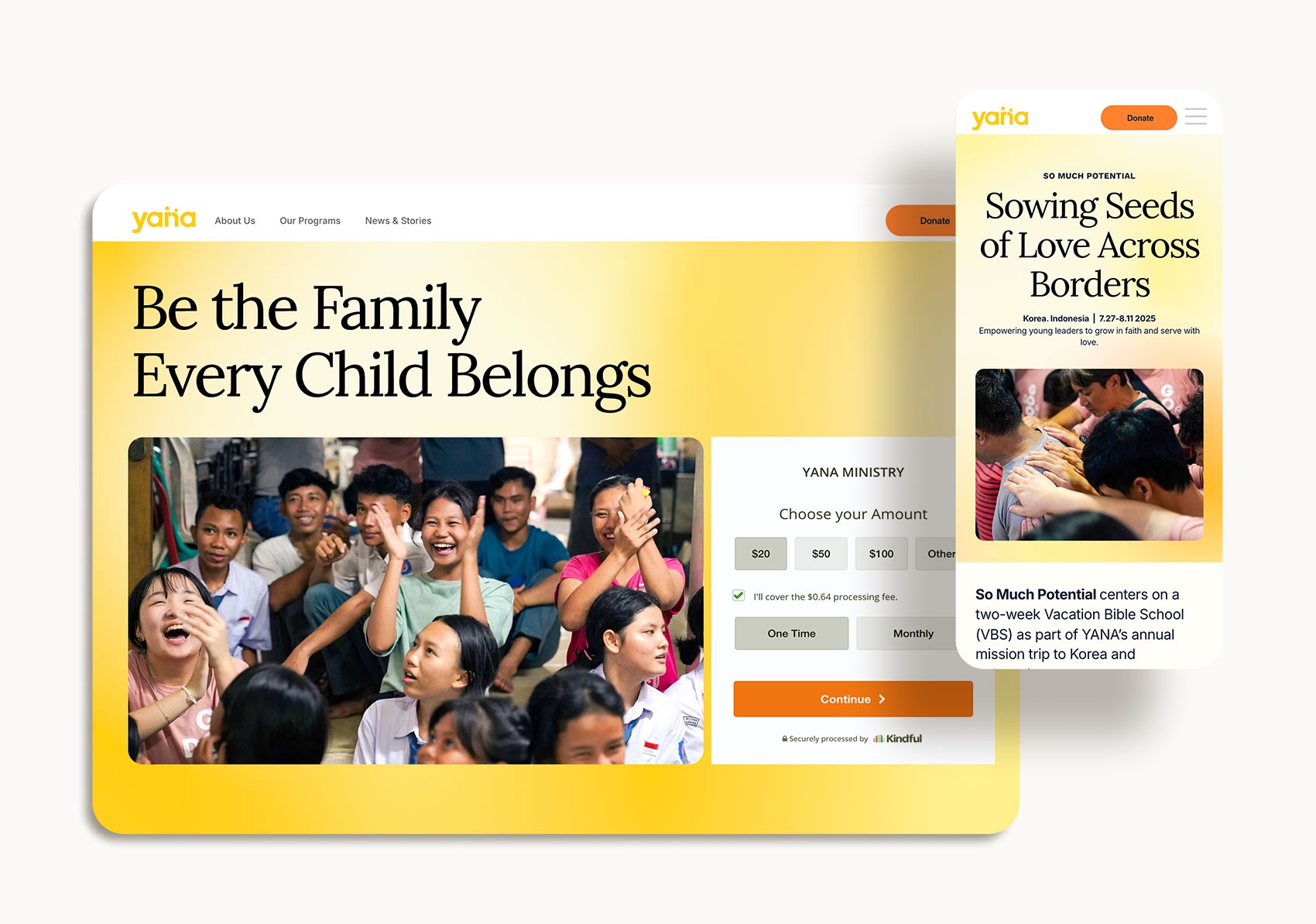
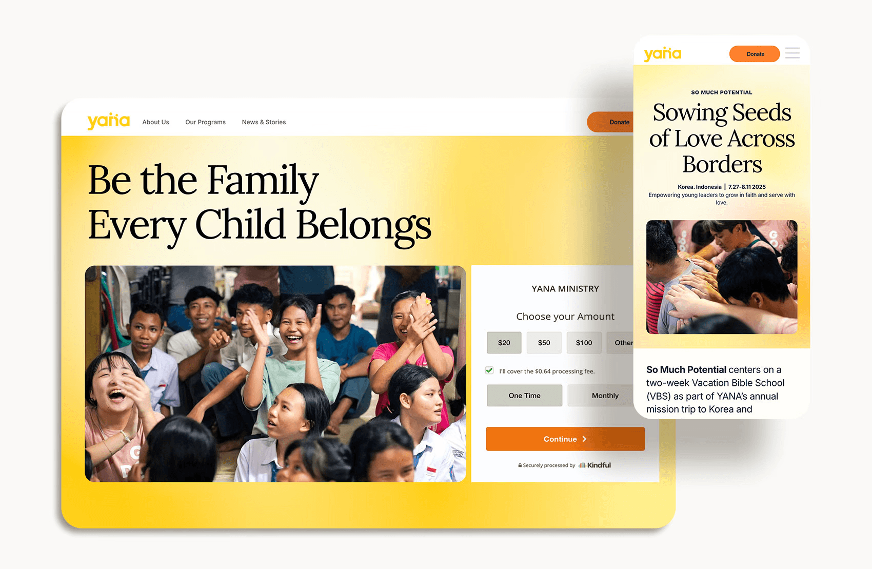
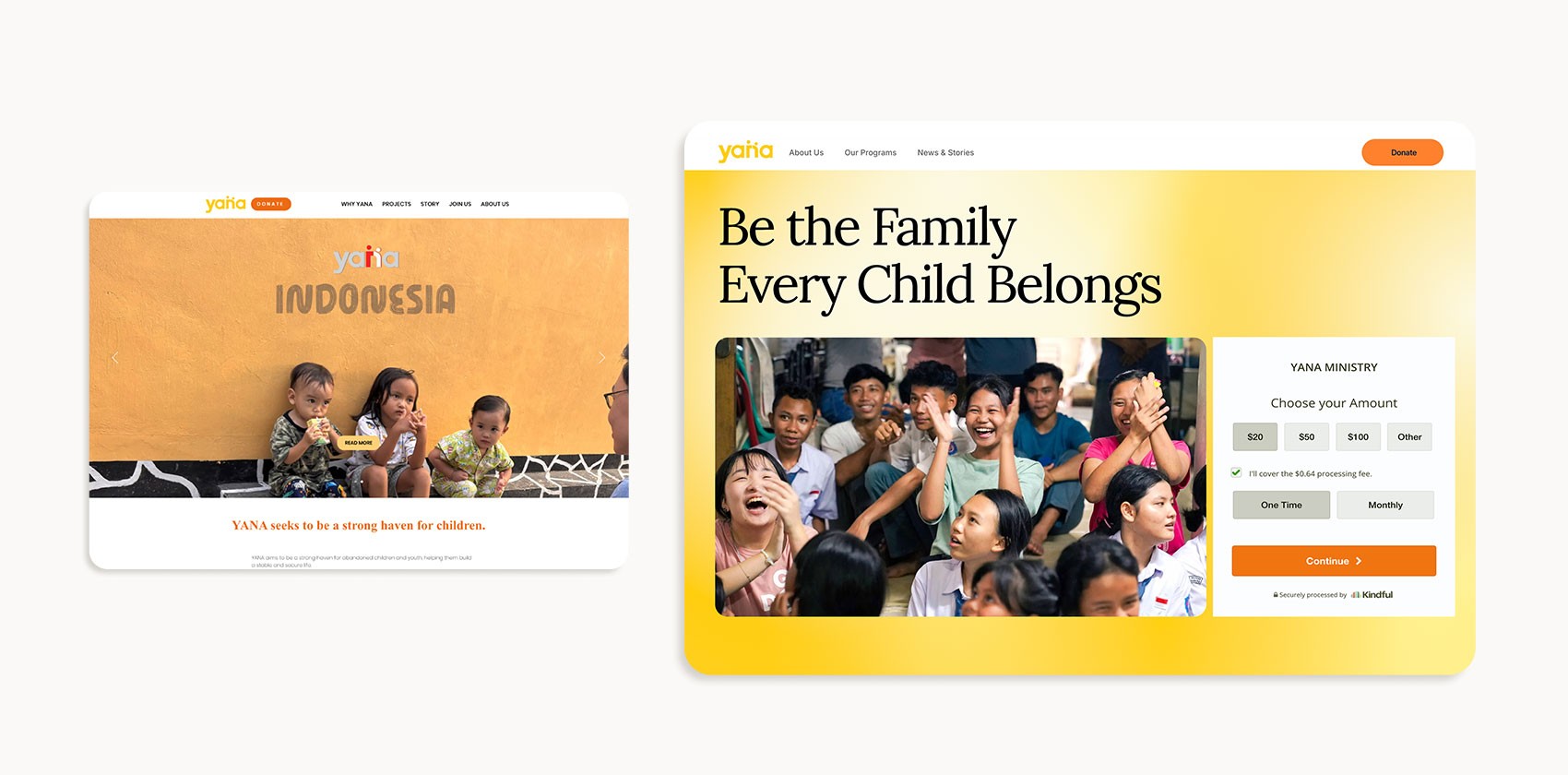
The redesign transformed the user experience through strategic improvements to three critical areas: the hero section, navigation structure, and donation flow. Each change directly addressed user pain points identified during research.
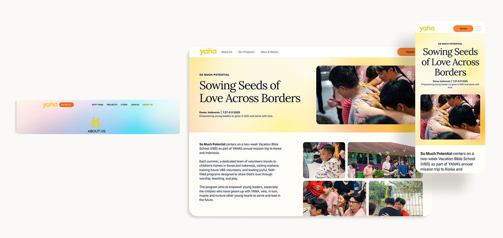
Old navigation

Old navigation

New navigation

New navigation

1. Navigation Structure Simplification

1. Navigation Structure Simplification

Problem

• Confusing page names
• Scattered content across too many menu items
• Disorganized structure

Solution

• Reduced menu items
• User-focused page naming
• Logical content grouping
• Persistent "Donate" CTA

Impact

• Users can navigate with confidence, resulting in reduced bounce rates.

Old homepage hero

Old homepage hero

New homepage hero

New homepage hero

  1. Hero Section Redesign
  1. Hero Section Redesign

Problem

• Couldn't understand the organization's purpose
• The original hero lacked a clear headline
• Not providing an immediate path to action

Solution

• Clear, Compelling Headline
• Representative Hero Image
• Prominent Donation Widget

Impact

Users now grasp the organization's purpose immediately and can donate without scrolling or searching.
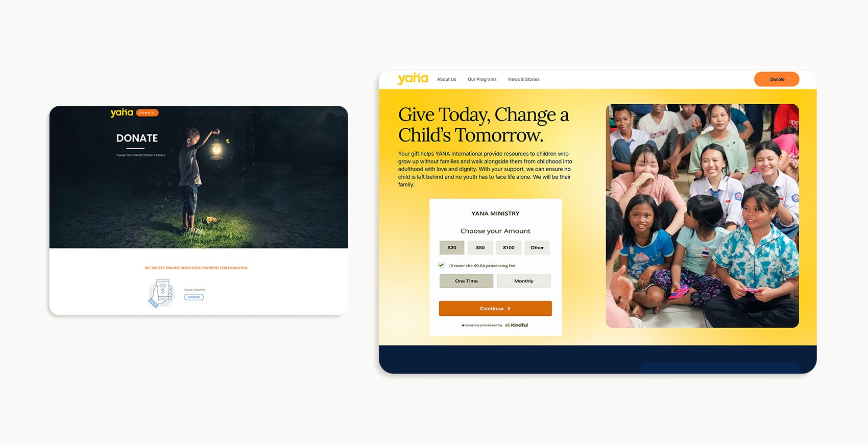
Old donation page

Old donation page

New donation page

New donation page

  1. Donation Flow Optimization
  1. Donation Flow Optimization

Problem

The original donation process required multiple clicks
This multi-step friction caused a significant drop-off in the conversion funnel

Solution

• Integrated Donation Widget
• Project Introduction Cards
• One-Click Selection

Impact

Reduced friction transformed donation from a multi-page journey into a seamless, significantly improving conversion rates.

Next Steps & Future Recommendations

Next Steps & Future Recommendations
Feature Enhancements

Feature Enhancements

Feature Enhancements

• Personalized Donor Dashboard
• Multi-language Support

Iterative Design Improvements

Iterative Design Improvements

Iterative Design Improvements

• A/B Testing Priority Areas
• User Testing for Mobile Experience
• Accessibility Audit & Enhancement

Metrics to Monitor

Metrics to Monitor

• Donation conversion rate by traffic source and landing page
• Donation form abandonment rate at each step to identify friction points
• Average donation amount and trends over time
• Recurring donor retention rate month-over-month
• Time to complete the donation to ensure the process remains efficient
• Mobile vs. desktop conversion rates to prioritize device-specific improvements
• User feedback scores through post-donation surveys

Looking Forward

Looking Forward

• By implementing these next steps and maintaining a data-informed approach to iteration, the website can continue to improve conversion rates, deepen donor relationships, and more effectively serve the organization's mission.