


01. Where the money was leaking
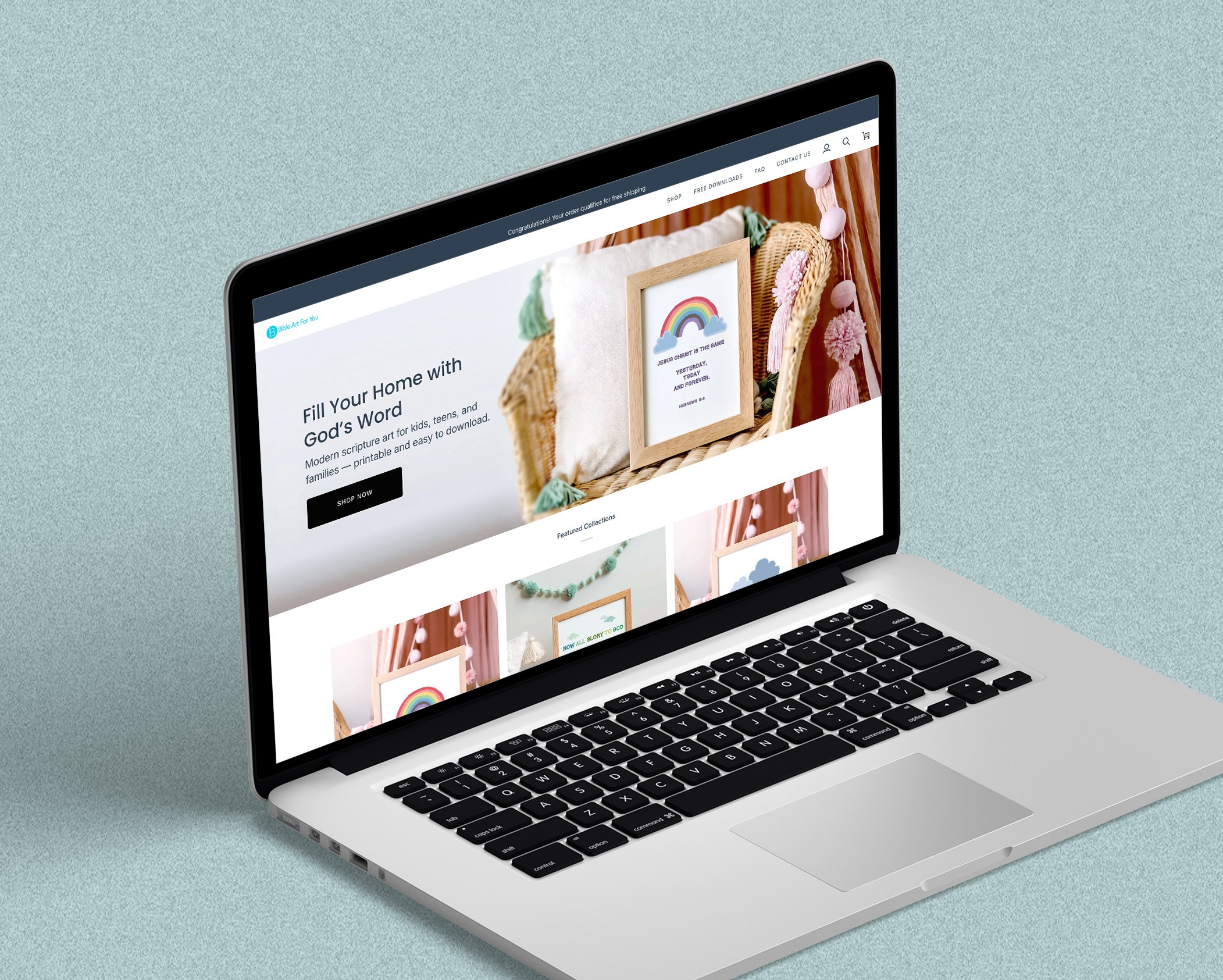
Mobile carried the traffic.
Desktop carried the sales.
02. The problem I chose to solve
High-intent pages had no direct path to purchase.
Users were evaluating artwork from mobile collection/product pages.
The purchasing path required users to navigate away from the decision point.
The experience required repeated page transitions before checkout.
03. What the old screens made people do
Before
Best Seller grid

Collection
• Cards were purely navigational — no way to add, no way to compare
• Price sat below the fold of each card; savings weren't visible while scanning
• The floating promo widget covered the third product's title
Before
Where every purchase was forced

Product
• Title and price appeared below a full-height gallery plus a thumbnail rail
• The promo widget sat directly on top of the product name
• Add to cart required a second scroll after the details accordions
Design principle
04. The change
Before
Browse only
After
Browse and buy

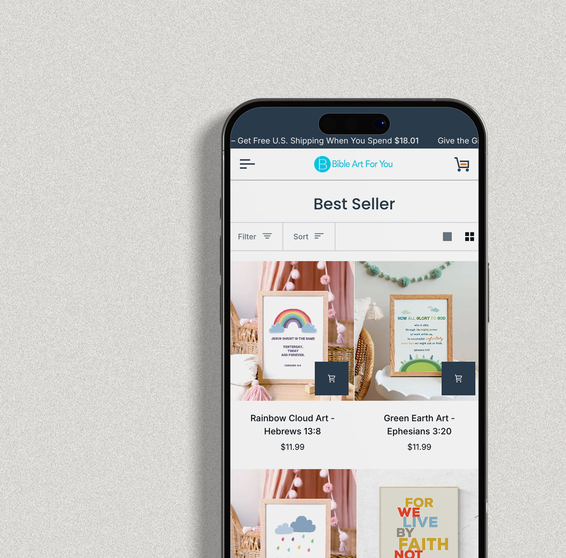
A persistent add-to-cart button sits on each product image. Returning customers — who already know the print they want — never have to open a product page.
Why this first: It removes three of the seven steps in a single change.
The gift widget generated almost no engagement and covered titles, prices, and the add-to-cart zone. I cut it and moved the offer into the announcement bar and cart drawer, where it's read at a decision point.
Why this matters: The highest-value pixels on a phone were being rented out for free.
Sale price, original price, filter and sort now live in the grid. The comparison happens while scanning, so the tap that follows is a purchase intent — not a research trip.
Why this matters: fewer product-page visits, but more of them convert.
05. The path now
Seven steps became four.
Step 01
Land
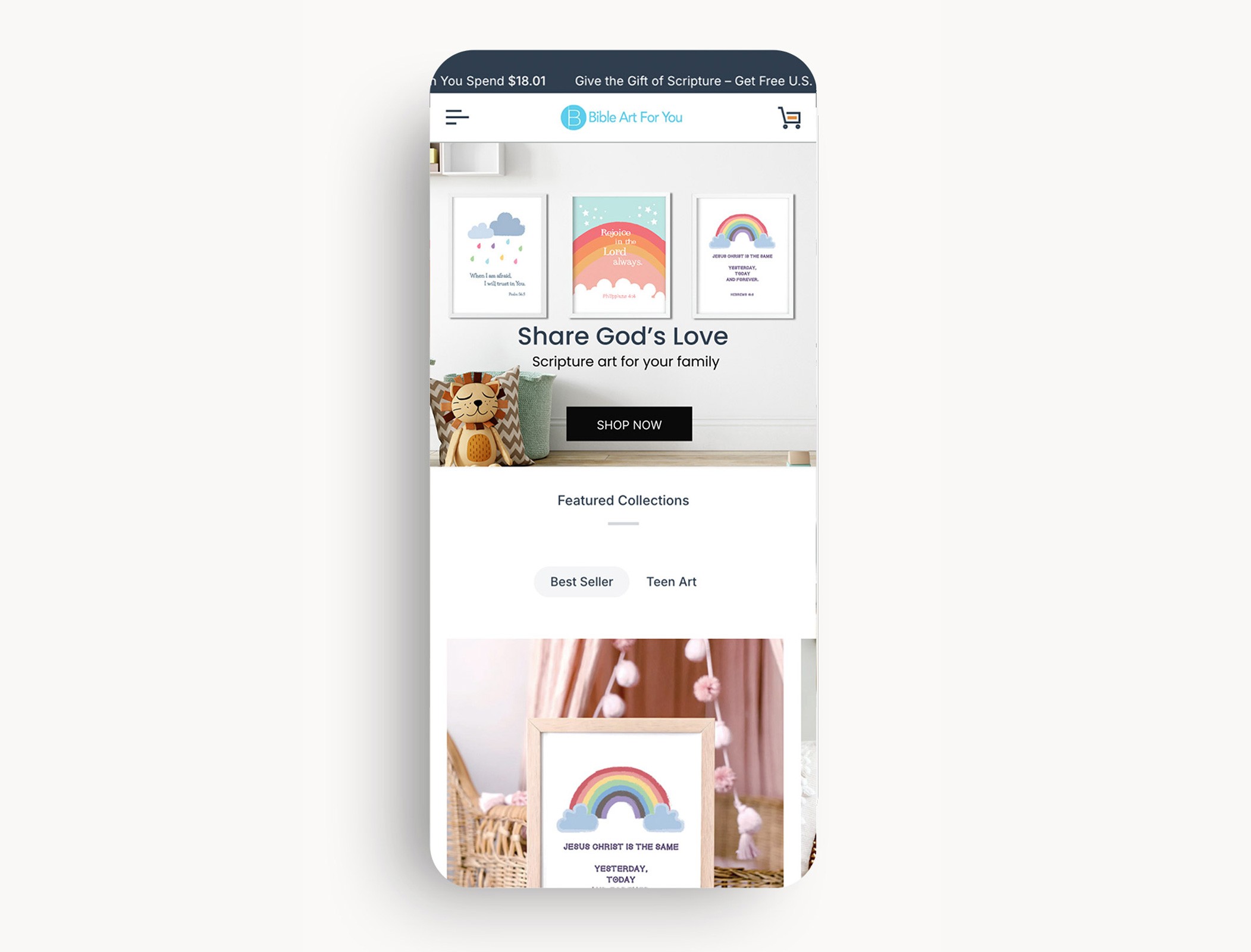
Hero reads clearly on a phone; collections start immediately below.
Step 02
Browse and add
Price, savings and add-to-cart all live in the card. No page change required.
Step 03
Review

Cart opens in place with a pinned checkout button showing the total.
Step 04
Pay

Express wallets sit above the form so returning buyers skip typing entirely.
06. Results
Seven steps became four.
07.What I took from it
Find the one step, then defend it
Small changes, measured, beat redesigns
Honest numbers are more persuasive
08.Where I'd take it next
Next case study