ONE BISON


ROLE:
UX/ UI Designer
SCOPE:
Marketplace UX
Seller onboarding
Product discovery
Checkout & payments
Design system
STATUS:
V3 — ongoing
Onboarding shipped,
Checkout in build
CHALLENGE
Shoppers couldn't quickly understand why One Bison was different.
Complex navigation and IA
Buyer, seller, service, and discovery paths competed in the navigation.
Low conversion for business signups
Pricing and onboarding left business owners unsure what they were choosing or what happened next.
No path to purchase on the platform
Purchases moved users off-platform, interrupting trust and limiting the marketplace relationship.
MY ROLE

I designed: Seller onboarding, pricing, discovery, cart, checkout, confirmation, and order-management flows.
I created: Information architecture, user flows, responsive patterns, and reusable components.
I partnered with: Product/founder, engineering, QA, and other business stakeholders to move designs toward implementation.
Mapped navigation, IA, signup, and transaction gaps across the live experience.
Used available analytics and product signals to identify where discovery and engagement were breaking down.
Combined founder, engineering, QA, and business feedback to understand operational and seller constraints.
KEY DESIGN DECISIONS

Clarifying buyer and seller intent at entry
Decision: Give product discovery primary prominence without hiding business signup.
Why: One Bison had two audiences arriving with very different jobs to be done.
Design response: Simplified navigation and homepage hierarchy around a dominant shopper journey, while keeping a persistent path for business owners.

Making seller value clear before commitment
Decision: Separate seller onboarding from the generic authentication experience and clarify what each plan includes.
Why: Asking business owners to create an account before understanding the value created hesitation.
Design response: Created a dedicated seller journey with clearer pricing, expectations, and progressive onboarding.
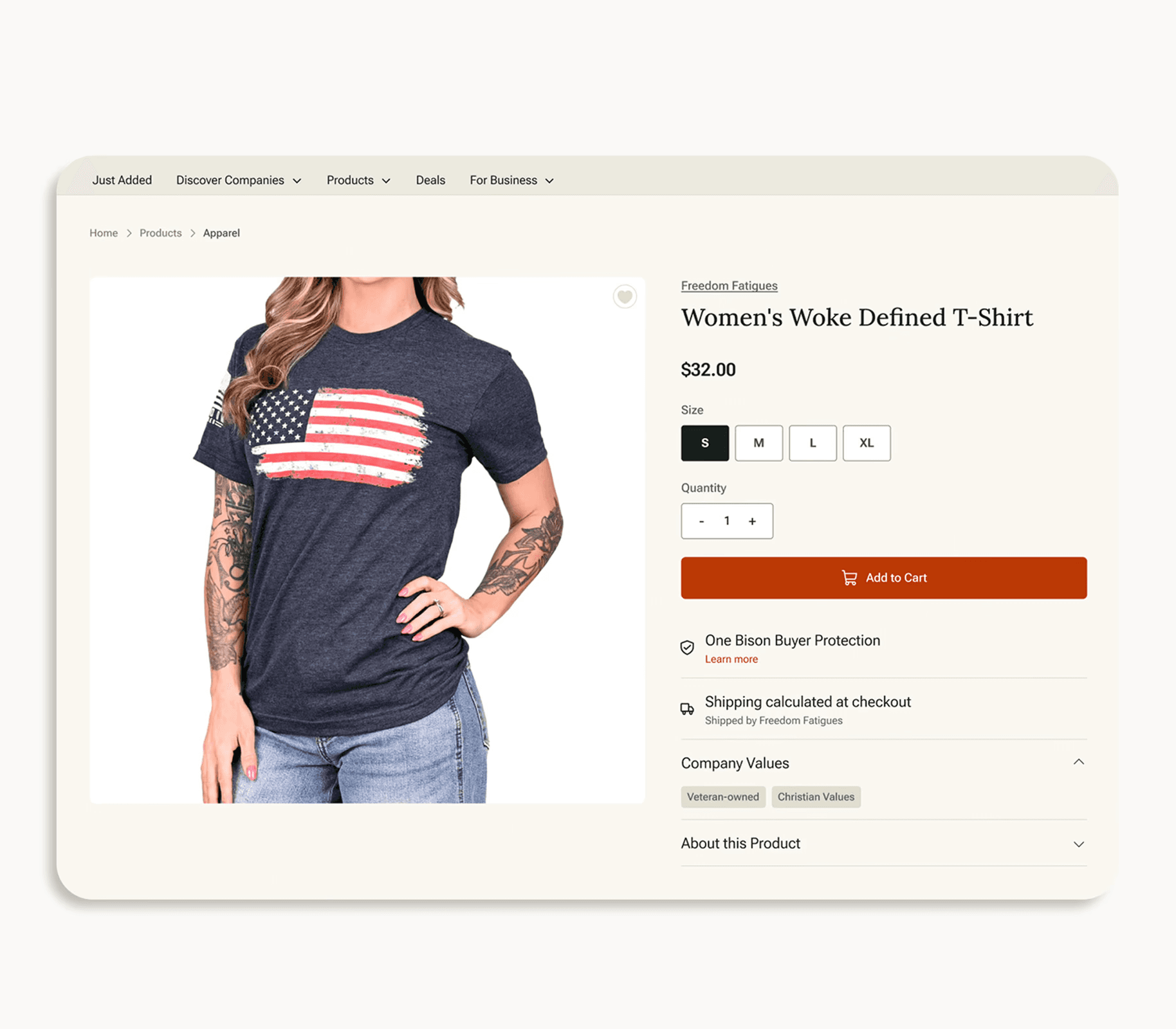
Carrying trust into the transaction
Decision: Treat trust as part of checkout UX rather than marketing copy.
Why: Buying from independent sellers introduces questions about payment security, fulfillment, and responsibility.
Design response: Added seller identity, buyer-protection language, itemized costs, payment reassurance, and clear post-purchase support.
THE TRANSACTION LIFECYCLE
Seller named above the line items, with a plain statement that the order ships directly from them.

Guest checkout with an account-found prompt, itemized costs, Stripe and buyer protection under the button.

Order number, ship-from seller, and a route into order history so the purchase creates an account relationship.

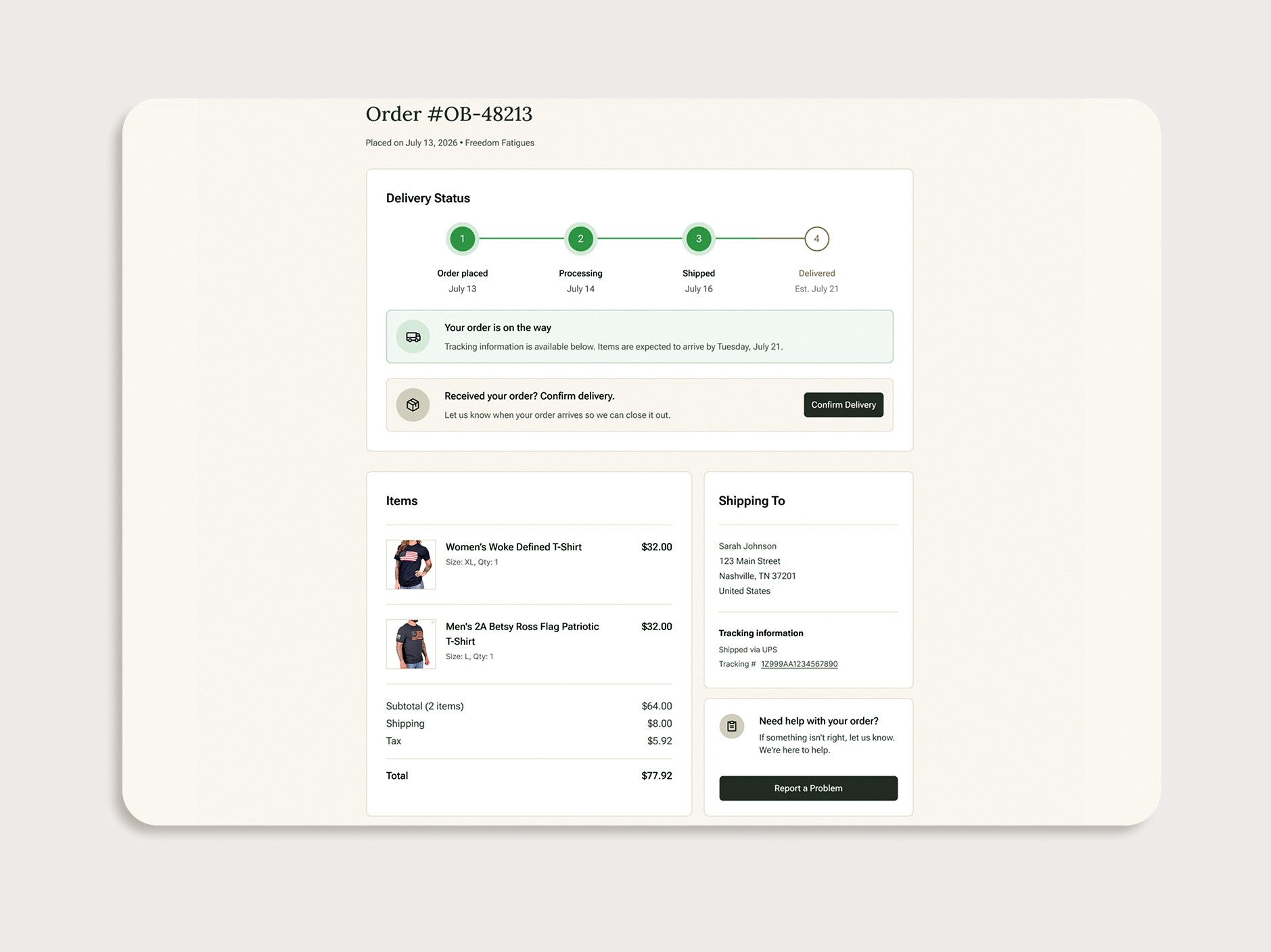
Delivery stepper, tracking, confirm-delivery, and an explicit “Report a problem” path — the backbone of buyer protection.
PRE-LAUNCH MOMENTUM
The commerce experience is currently in development.
The growth above reflects One Bison's existing business and pre-launch marketplace momentum—not post-launch commerce performance. My work focuses on designing the seller, discovery, checkout, payment, and post-purchase experiences that will support this growing ecosystem when transactions go live.
AI-assisted product listing
Intent-aware discovery
Post-purchase assistance
WHAT I'D DO DIFFERENTLY
Instrument before redesigning
I designed the signup funnel before reliable event tracking existed. Next time, I would establish baseline events before making major flow decisions so that prioritization is grounded in behavior rather than persuasion.
Design for the commerce model, not today's edge case
My first checkout assumed one seller per order. Supporting multi-seller transactions later introduces split shipping, payouts, and order-status complexity that would have been easier to model earlier.
Talk to sellers sooner
The onboarding flow relied heavily on existing team knowledge and competitive patterns. Earlier seller interviews would have helped me validate which setup fields actually created the most friction.
Next case study